Web 2.0, Internet, Technology, News, Images, Videos, Mobile, Politics, Games, Movies, Entertainment, Music, iPhone
Categories
- News (29)
- World Technology (20)
- iPhone (17)
- Jailbreak/Unlock (13)
- Windows (13)
- iPhone 3GS (13)
- Sony (10)
- Google News (6)
- iPhone OS 3.0 (6)
- UltraSnow (4)
- AMD (3)
- Android (3)
- BlackBerry (3)
- Intel (3)
- Nokia (3)
- Palm (3)
- Software Downloads (3)
- Window 7 (3)
- AlienWare (2)
- Guides (2)
- LG (2)
- Mac (2)
- Purplera1n (2)
- Purplesn0w (2)
- Software (2)
- iPad (2)
- iPod (2)
- redsn0w (2)
- Acer (1)
- Adobe (1)
- Apple (1)
- Asus (1)
- Dell (1)
- EVGA (1)
- Flipboard (1)
- Free (1)
- Games (1)
- HTC (1)
- LG Windows Phone (1)
- Logitech (1)
- NFS (1)
- Nintendo (1)
- Razer (1)
- Reviews (1)
- Samsung (1)
- Security (1)
- SideKick (1)
- WordPress (1)
- Xbox 360 (1)
- iPhone 3GS Review (1)
- iPhone 4 (1)
Labels: News

PortaBella is now shipping and caters to markets demanding fast, reliable and secure portable Internet access such as:
- News-gathering agencies (DNG / ENG crews, outside broadcasting trucks)
- Mobile TV broadcasting
- CCTV
- Security and remote monitoring video cameras (business and consumer)
- Transportation and specialty vehicles (buses, trains, taxis, limousines)
- Maritime (commercial, private, and military)
- Point of sale / information kiosks (Internet kiosks, banks, gas stations, digital signage)
- Government agencies (FEMA, Department of Homeland Security, Office of National Capital Region Coordination – NCRC, and Department of Emergency Response)
- Temporary Offices (construction trailers, portable tent offices, unconnected commercial offices)
- Cellular backhaul to WIFI hotspots
Mushroom Networks is actively pursuing channel partners to expand PortaBella’s reach across its targeted verticals. For more information on PortaBella including a brochure available for download, visit the products section of the company’s website at http://www.mushroomnetworks.com.
Labels: News, World Technology
Labels: News
Labels: News
Pfff, you wait ages for new Smartphone devices and then a bunch come along at once... this is the new GW550 Windows Mobile Standard Smartphone from LG!
Pictured here courtesy of PhoneArena, the GW550 packs...
I think it looks classy AND it has a proper directional pad, hurrah! ![]()
Watch out HTC Snap / Samsung Jack / Samsung OmniPro... there's a new player in town... ![]()
P
[Addition images via ePrice]


Labels: LG Windows Phone
1. For install copy mms2g.deb to iphone in folder, for example /var/root
2. Then in same folder (/var/root) in terminal input: dpkg -i mms2g.deb
3. Reboot.
or
1. Extract files from Patch.zip to iphone to folders same as arhive. For CommCenter chmod 755.
2. Reboot.
In settings adjust apn, user, password.
It is in cydia and named as ActivateMMS2G. All you have to do is ad rep. in cydia: http://cydia.alpden.com/ .
Labels: iPhone, Jailbreak/Unlock
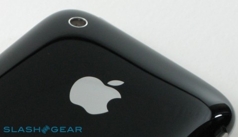
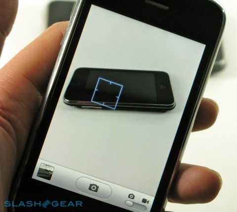
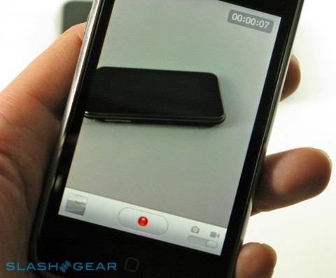
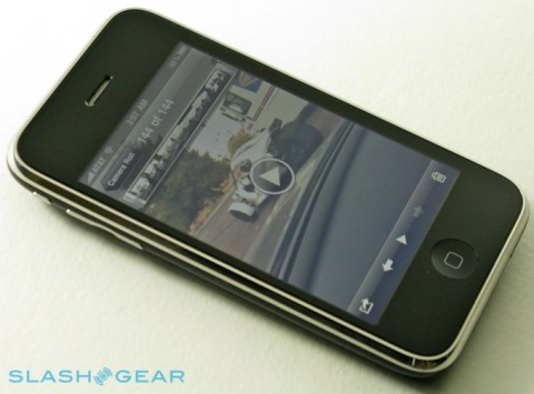
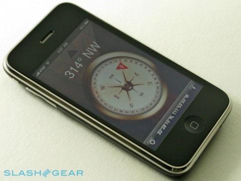
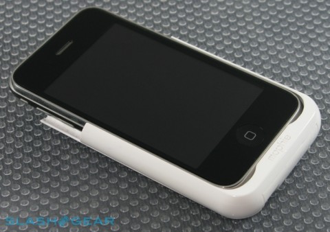
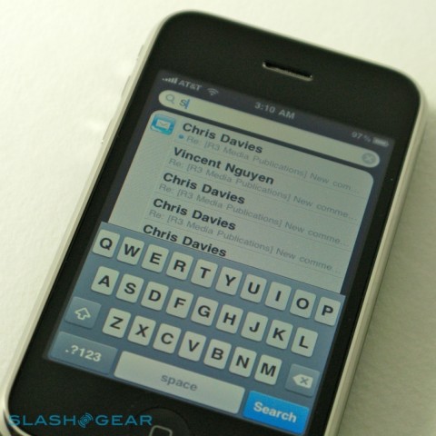
Take a guess of how many units can be sold in first 3 days? One millioin is the word out, YES ONE MILLION. With over one million iPhone 3GS units sold in the first three days, there’s no shortage of opinion as to Apple’s successes in their latest smartphone. We’ve covered the basics in our hands-on first-impressions piece; with a few more days of intensive use under our belt, has the iPhone 3GS proved its worth? Slashgear took the initiative of reviewing the iPhone 3GS. Following is taken from thier website and all the credit goes to them. Thanks. The iPhone 3GS’ striking physical similarity to the last-gen 3G came as a mild disappointment back at the WWDC, but we’ve come to appreciate the stability. It underscores the evolutionary, rather than revolutionary, nature of this update and, perhaps more importantly, it means accessories acquired for the iPhone 3G will still have a place with the new 3GS. For a device introduced halfway through the contract agreement of its predecessor, that sort of continuity was pretty much necessary if there was to be any hope encouraging existing owners to upgrade. We do wish that Apple had been a little more imaginative with the finish, however; a matte coating, perhaps slightly rubberized, would differentiate the new handset while not demanding reinvestment in car-kits, cases and cradles. Many hoped for the introduction of a hardware keyboard, always a long-shot considering Apple’s touchscreen affections, and came away disappointed. Still, the on-screen QWERTY keyboard remains one of the better – and arguably the best – such implementation, and Apple has only improved things with the landscape-orientation version, which is now accessible in many more apps. That’s not limited to the For those that do bite the bullet and upgrade, their first impression will likely be of the new iPhone’s speed. Apple’s “the S is for Speed” may have reeked of marketing hyperbole, but that doesn’t make it untrue. Definite hardware specifications haven’t been revealed, but we’re led to believe that Apple have slotted a new 600MHz processor, twice the ram – at 256MB – and a new PowerVR SGX graphics chip into the iPhone 3GS. Instead of cold specs, though, Apple prefer to describe the 3GS as twice as fast on average, and our initial impression of a cleaner, snappier device hasn’t waned. As you might expect, it’s in data-packed applications such as an email inbox or contact-heavy address book that the new grunt shows itself best, with the periodic pauses, stutters and lulls of the iPhone 3G now smoothed out. Speed, though, is one of those things that users eventually learn to ignore, both as they become acclimatized to the increase and as the device itself gets more loaded up with apps and content. Because of that, it’s the more tenable improvements over the iPhone 3G that make themselves known in the 3GS, and they can be summed up in four areas: camera, compass, voice control and battery. It’s the camera that has had the most attention, and rightly so; in terms of what the iPhone 3GS has on offer, it’s the biggest jump in consumer-friendly features on the spec sheet. Out goes the unloved fixed-focus 2-megapixel snapper from the iPhone 3G, and in comes a 3-megapixel autofocus replacement with support for video recording. As we’ve already said, straight snapshots are no harder to take than on earlier iPhones, with the 3GS’ autofocus controlled by tapping on the preview screen. The same system has been used on several other smartphones, not to mention a number of consumer digital cameras and camcorders, and it works just as well on the iPhone 3GS as it does on the rest. Focusing is relatively quick and generally accurate, and can be left to do its own thing if you decide not to bother tapping. We wish Apple had added a macro mode, however, for close-up shots; apps like Evernote, which can use OCR to pull text out of a photo, do a lot better when the shot is crisp and up-close. Flick the switch into video recording mode, and the iPhone 3GS shows off its next new trick. We’ve been asking for native videos capture since the first iPhone, and Apple have finally delivered with VGA quality at 30fps. If we complained about a lack of manual control in the still camera, though, we’re even more bereft when recording video: the 3GS assumes all control over focus, leaving you nothing to do but tap the record button. You’re looking at a little under 5MB for every ten seconds of footage, in our experience, with the raw file saved in .mov format. Apple has seemingly tuned their new optics to video recording, in preference to stills. Normal images seem a little soft and over-exposed – which of course there’s no way of changing on-device – whereas footage is crisper and smooth. We’ve heard quite a few people say the iPhone 3GS could replace a Flip camcorder or similar, and that’s certainly true when measured in convenience, but unless you’re still using a first-gen Flip we don’t think it’s quite up to that level as yet. Quality is decent for a smartphone, yes, but not earth-shattering. Once you’ve got your footage, the iPhone 3GS does what few mobile devices offer and allows you to edit those clips. When the first rumors circulated about such functionality, we did have hopes for a cut-down version of iMovie for iPhone; unfortunately the reality is somewhat more basic. Grabbing and dragging their respective icons can trim the start and end points of each clip, but beyond that there’s nothing else. We would have liked to see clip merging or at least the ability to string a number of clips together, maybe even a few transitions and titling options, but it looks as though we’ll have to wait for that. As we noted in our first-impressions piece, one of the more frustrating aspects of iPhone 3GS video editing is its destructive nature. Slice off the start or end of a clip and that’s it; there’s no way to copy the file and edit that copy, you’re always working with the original. We imagine Apple have done things this way in the name of simplicity and preserving storage space, but it joins the list as another thing we’d at least like to have the option to decide for ourselves. Sample video uploaded to YouTube: Still, once you’ve done whatever trimming you want, it’s a simple matter to upload that file to YouTube or MobileMe, with the 3GS automatically compressing it to suit. You can also send it as an email attachment or – if your carrier supports it – MMS. Strangely, there’s no Flickr upload option for still photos. Making a big deal out of a digital compass may seem a little strange, but we’ve already seen how beneficial one can be on HTC’s Android handsets. Out of the box, the iPhone 3GS offers either standalone access to the compass, or integrates it with Google Maps. Tapping the “Find Me” button once loads up GPS, as before, but tapping it again turns on the compass; the map automatically rotates to show which direction you’re facing. It works smoothly and without any stuttering, but we were disappointed to find that it doesn’t pan around Street View as on Android phones. Nonetheless, it’s a decent start, and once third-party apps begin to tie into the compass we’ll likely see even more use of direction data. Voice Control is less successful, and that’s jointly down to a limited number of command options and only passable recognition accuracy. Triggered by holding down the home button for a few seconds, it can be used to control either the iPhone 3GS’ call features or PMP functionality, with relatively naturalistic commands such as “call Alex Patterson” or asking “what track is this?” Contact recognition seemed more successful than over in the media app, where complex or similarly sounding artist, track or playlist names presented Voice Control with more trouble. Where the similar system on the latest iPod shuffle makes sense, though, seeing as that PMP lacks a display, we found it generally quicker to flip through tracks via the iPhone’s ever-responsive touchscreen, especially now that the faster processor speedily handles sizable music catalogs. As for battery life, Apple is quoting some reasonably significant leaps in runtime for the iPhone 3GS over its predecessor. Perhaps it’s the impact of a still-not-quite conditioned battery, but we’re yet to see any major improvements; admittedly we’ve been using the 3GS hard over the past few days, but then we’re also heavy users of the 3G before it. The biggest improvement, looking at the 3GS’ spec sheet, is in media playback and WiFi browsing, which will come as a relief to anybody looking to stock up on 32GB of audio and video; we find ourself wishing that 3G browsing had received a similar boost, though, as in our experience that’s the most significant drain on battery life. The iPhone 3GS will last a full day with reasonable, all-round use, but don’t expect miracles of longevity. Happily the backward compatibility with accessories like Mophie’s JuicePack means external batteries are still usable with the new handset. The rest of the iPhone 3GS’ notable features are brought by virtue of iPhone OS 3.0, and as such available to existing owners too. That includes A2DP stereo Bluetooth – though not, frustratingly, AVCHP remote control, meaning the buttons on your stereo headset won’t control playback – and cut, copy & paste. The latter certainly works better than it does on the Pre; with the ability to not only grab chunks of editable but non-editable text (such as on webpages or in received emails) together with images and formatting. Ironically, perhaps, after being such a demanded feature we’ve found that we don’t particularly use cut, copy & paste all that much; still, it’s a feature that should have been present from the start, and certainly makes the iPhone 3GS more complete in its capabilities now that it’s here. Two other significant improvements from OS 3.0 are Spotlight and Push Notifications. The former is Apple’s response to universal search, and is certainly thorough; it bests Palm’s Pre search by covering email – both on-device and on the server – notes, contacts, calendar entries and applications. The downside to all that content is that, once you have your list of results, you then need to tap them and go into their respective app to actually do anything. Not so bad with emails and notes, but there’s no way to call a contact directly from the search results, for instance. Push Notifications are Apple’s answer to background apps, which the company claims still have too great an impact on battery life. Developers can now take advantage of pop-up messages, audio alerts or message counters, with Apple’s servers handling the hard work of monitoring for changes while the iPhone itself trots along happily, its battery unaffected. It works, in as much as it sets out to do so, relatively well: load up AIM and, if there’s a new IM message while you’re browsing the net, it’ll throw up a box telling you so. Meanwhile the numerical counter by the AIM icon continues to climb, just as it does by Apple’s own Mail or Calls icons. The downside, of course, is that apps have to be specifically coded to take advantage of push notifications, whereas that’s not the case for simply leaving a program running in the background. One argument might say that doing so forces the developer to conform to good app writing practice, but it also applies limits that maybe aren’t there in the same way when background apps are allowed universally. Keeping software quietly running isn’t just about keeping track of new messages or game updates; it also means apps that automatically upload new photos, or that play internet radio, can do their magic. Push notifications don’t address that, and nor really can they. Apple’s arguments begin to look a little churlish when you contrast the iPhone with, say, Palm’s webOS on the Pre, which for all its first-gen glitches still manages to handle multiple running apps in a smooth and intuitive way. As we started out by saying, the iPhone 3GS is an evolutionary upgrade for Apple, not a revolutionary one. They, perhaps unlike any other cellphone manufacturer however, get to take that evolutionary step because the product they started out to improve was so proficient in its own right. The fact that the iPhone 3G stays on sale alongside the 3GS – albeit as the cheaper sop to budget buyers – shows that there’s still plenty of appeal in what’s now last-gen hardware, and that’s not a situation you find applies to many other companies. We owe the iPhone for its work in pushing rivals to up their game; without it, we doubt handsets like the Pre and platforms like Android would be so advanced. So, the iPhone 3GS should feel flattered at the opponents it has stimulated, but does it make a convincing case on its own? For all the carriers’ conciliatory gestures, the upgrade pricing for existing iPhone 3G users is significant, especially if you don’t satisfy their criteria as an eligible – read “high-paying” – customer. For new customers it’s a more straightforward matter: we’d walk straight past the $99 iPhone 3G, and stump up at least the extra $100 for the 16GB iPhone 3GS. Over the course of your contract that’s a little over $4 per month, or fourteen cents a day, and we’d happily pay that for double the storage and a speedier handset. Apple’s iPhone is a fantastic smartphone, undoubtedly, and the extra 3GS features – not least iPhone OS 3.0 – only make it better. It’s more of the same from a company we’ve come to respect for how they blend innovation with usability; no, it’s not perfect, but it’s certainly good enough to be a legitimate contender for any user wanting a powerful mobile device. Don’t forget, you’re getting what perhaps we now take for granted: a mobile browser that’s still arguably best in class, a fine media player and a mobile App Store that’s packed like no other. Even if you’re not an Apple fan, or nowhere near tempted by the iPhone 3GS, you can rely on it to motivate rival platforms to get even better. That, perhaps, is the mark of a truly good device: it drives the market in which it sits to strive for even greater things.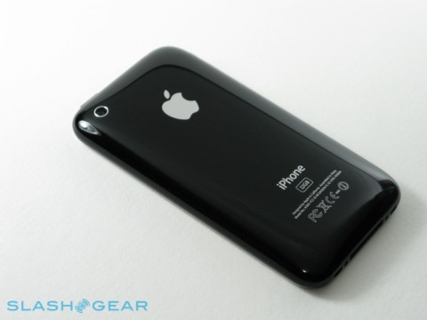
3GS, of course, and is one of the many improvements in iPhone OS 3.0; ironically, Apple’s main competitor for the new smartphone could in fact be owners of its predecessor whose upgrade urge has been lulled by the free software update.
Labels: iPhone 3GS, iPhone 3GS Review
We don't know exactly what's new yet, but Palm's released firmware version 1.0.4 for Pres on Sprint (not to say there are any other Pres out there at the moment, anyhow). Stay tuned for details.
Update: Looks like the only changes here address security vulnerabilities -- and interestingly, Palm gives a shout-out to Townsend Ladd Harris (a Pre homebrewer no less) who helped find them. Cheers to that.
Update 2: Sadly, Palm's plugged the hole that allowed homebrew apps on the phone without a jailbreak, though software you've already installed on the phone will continue to work. The hole that's been plugged was admittedly dangerous to leave open (installing apps via a link in email), though rooting and installing otherwise remain unchanged as far as we know.
Labels: Palm
How can you make your external USB Blu-ray drive better than everyone elses? Well, you could make it a Blu-ray burner, give it a range of connections and make it super-cheap, or you could go the ASUS way and put a great big light-up blue X on the side. According to ASUS, the SBC-04B1S-U’s “elegant stand design and high glossy appearance represents its high feel of science and technology”, which is perhaps stretching the limits of what a basic USB Blu-ray reader can be described as. They also provide a dedicated app for adjusting the light-up X’s brightness, meaning you can have it set to different levels when reading or writing different media. Baseline specs are 4.8x maximum Blu-ray disc reading, 8x DVD burning and 24x CD burning. It connects via USB 2.0 and is compatible with Windows but not OS X; no word on exactly how much that big flashing X will set you back, though.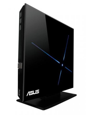
Labels: News

Yes, this is epic stuff. The Pre (and its accompanying operating system) could likely decide the fate of the company largely credited with ushering in the age of the do-everything phone. Since Palm's announcement at CES this year, news surrounding the Pre has been a veritable whirlwind of activity: rumors, half-truths, hate, love, fear-mongering, fanboyism, rampant gadget-lust... and even a little late night celebrity for the pint-sized phone. Finally the time has come to put rubber to road and get into the guts of this thing once and for all. Can the Pre and webOS live up to the hype -- the kind of hype we haven't seen since the launch of the original iPhone -- or do they snap under the pressure? Read on for the full review.
The hardware
Industrial designIn terms of basic industrial design, the Pre is stunning. Palm has gone to great lengths to talk about the feel of the phone, its likeness to a polished stone, how well it sits in your hand, and we'll admit... it does feel pretty great. The shape of the device is distinct, not quite taking a hardline flat-and-square approach of most brick phones, instead exaggerating the curves of the iPhone 3G to their logical conclusion. Closed, the Pre resembles a tiny, extremely glossy black ball. Needless to say, sliding this into and out of a pocket -- even a tight pair of jeans -- is no trouble (though it is a bit chunky around the middle, clocking in at 0.67-inches at its thickest point).
The front of the device is coated in a tremendously shiny and extremely smudge friendly plastic. The 480 x 320, 3.1-inch capacitive touchscreen is totally flush with the surface of the device, and it just about runs edge-to-edge. Above the screen is a small silver earpiece, and below is the center button, which looks like a small metallic ball embedded in the plastic, but is actually partially transparent, making an LED inside visible when performing gestures (more on those in a bit). Around the left side of the phone are two small volume rocker buttons, on the right is the MicroUSB cover.
The top section of the phone has a hold / power button located on the upper right corner, and next to it sits the old Palm standard -- a ringer on / off switch. In the center is a 3.5mm headphone jack (yes!). The backside of the phone reveals the camera, tiny flash, and new stylized Palm logo.

Underneath all this plastic there's a TI OMAP3 processor (though we don't know what it's clocked at), 8GB of storage (of which about 7GB is user accessible), and an undisclosed amount of RAM (we're guessing around 256MB). There's also a proximity sensor and a light sensor, both of which work almost exactly as they do on the iPhone (like dimming the screen when you put the device to your ear to talk), and an accelerometer, you know... for making stuff flip around.
The Pre, of course, contains a sliding mechanism which reveals a QWERTY keyboard beneath. One of our first minor issues was the build quality here. There's nothing tremendously alarming about how these two pieces connect, but there is certainly a small give when the screen is in its closed position. Sliding the display up, however, definitely made us pause a bit. At first it doesn't seem like there's the kind of tight clicking action you'd expect here -- it does slide up and lock firmly into place, but there's a lot of play from point A to point B. For instance, if you slide the screen slowly, it's possible to just have it stick in a half open state, and we also noticed that there's a divot -- a stopping point -- early on when the slide begins which the screen seems to settle into a bit too easily. What we realized through repeated use, however, is that the faster you slide the screen, the sturdier the mechanism feels -- it's just not that obvious at first. Though we'd rate the general seating and feel a bit higher than the G1, we still wouldn't say that this is as good as it gets -- but it's certainly not a deal-breaker.

When you do slide out the bottom half of the phone, the shape takes on a more banana-like appearance. The bottom and top pieces curve along the same angle, making the phone just a bit taller than the iPhone and G1. Around back, a mirror is revealed when you have the keyboard out, though we'd like to stress that it's for men and women alike.
Besides the standard issues we had with the construction of the phone, we did spot another peculiar problem we hope is just a one-in-a-million fluke with the test device we were given: it physically broke.
There is a small flap that covers the MicroUSB port, and while attempting to get the thing open, a thin piece of plastic which runs along the bottom of the casing just snapped. Now, we're not saying this is a widespread problem -- in fact, reps at Palm claimed this was the first time they'd seen it happen -- but it was a little disconcerting. Still, hats off to them, because they went above and beyond the call of duty to bring us a second phone: they sent someone on a plane from San Francisco to LA!
Our personal damage aside, the Pre is a beautiful piece of technology, and it's clear that a lot of time and love went into the design. It's not perfect, and the quality of the components don't quite match up to those of the Storm or iPhone, but it's a really great looking, reasonably solid device that we'd be happy to show off to friends and loved ones.
Gallery: Palm Pre size comparison
Display

Touch sensitivity was more than acceptable, though we do take issue with tracking and accuracy in some instances, particularly when you're close to the edges -- taps sometimes go unregistered and your aim can feel off. Our judgment is that it's not a screen issue, rather a software sensitivity quirk that could seemingly be fixed with an update. Overall though, the touch experience -- whether due to smart programming or the particular display used -- outclasses most other devices in this category (the iPhone still bests it in this department though).
Keyboard

Since this is a Palm phone, and since it's introducing the rarely-seen portrait slider configuration, the keyboard has been a subject of tremendous debate. Well, we can put your mind at ease folks -- it's actually pretty good. Now, we won't lie, it's not quite the barnstormer of the Bold or Treo 650, but it is a very, very solid typing experience nonetheless. The keys -- made of a similar rubbery material which the Treo Pro and Centros use -- have a surprising amount of depth given their location, and they're actually somewhat clicky (a surprise to us). Spacing between keys is ample, but we wouldn't say generous -- though in general getting accustomed to typing on the Pre wasn't too painful. Our biggest gripe is actually with the software, which omits some no-brainers like double-tap spacebar for periods (though in the phone's defense, it does have a dedicated period key). Auto-correction is in effect here, fixing your lowercase i's, un-apostrophe'd contractions, and the occasional misspelling, but it pales in comparison to the iPhone's intelligent input recognition. We're not quite as fast with the physical keyboard as we'd like to be, but we count our major gaffes or mistypes in the dozens on the Pre -- a number easily eclipsed when using one of its virtual siblings.
If you're worried about copy and paste, by the way, have no fear. Palm has certainly included it here, and simplified the process by employing the gesture area and keyboard for shortcuts. To move your cursor in a text field, you hold down the orange key and swipe in four directions to navigate. To select, you use the same technique, but hold down the shift key instead. Cutting, copying, and pasting are handled via combos of placing a thumb or finger on the gesture area and tapping X, C, or V.
Camera

Look, we're just going to say it: we love the Pre's camera. There are two things happening here that make it lovable. First, it's 3.2 megapixels, which makes it at least competitive with its contemporaries. Second, Palm has done something totally radical in webOS -- they've made it so the image processing is backloaded when you're shooting. What that means is that you can snap away without having to sit through the shutter lag you're probably used to, allowing you to actually use the thing like a real camera. Furthermore, the image quality we saw was more than sufficient for on-the-scene shots, with particular clarity and color in daylight shots, though a surprising amount of definition in low light situations as well. Oh, and did we mention it has a flash?
Of course, Palm doesn't provide a video option here, which should chafe some folks. Why they decided to leave it off is a mystery to us (we're going to guess a rush to push this thing out the door before their six months were up), but we'd be surprised if we don't see video recording come to the device in the future.
Gallery: Palm Pre camera test
Audio quality
Audio on the Pre doesn't disappoint either. The earpiece is very clear and plenty loud, and according to the unlucky humans who've received calls from us, our outgoing sound quality wasn't too shabby (on one call using the speakerphone, the caller didn't even know we weren't holding the device). Speaking of the external output, we can say it's loud, though by no means perfect (we found its range to be a bit middy). It was certainly usable, due mainly to the fact that you can actually make out what your caller is saying, but we've been spoiled by the output of the Bold -- our new high-water mark for phone speakers. For playing music or anything beyond a simple conversation, you'll want to use that headphone jack (or stereo A2DP).
webOS / user interface

We're really reviewing two products here. One is the hardware, obviously. The other is the operating system which will be Palm's platform for mobile devices for the foreseeable future: webOS. Some of the ideas behind webOS -- a Linux-based platform which leverages web standards for development -- are revolutionary for smartphones. It dashes as many design paradigms as it adopts, so there's quite a bit that's fresh here. The real question is not if those ideas are revolutionary, however -- it's if they're usable.
Cards

The main focus of webOS is cards, essentially a list of open applications which can be moved into and out of with the press of the center button or a swipe of your finger. The emphasis here is on multitasking as well as reducing the number of steps required to go from one action to another. The premise is extremely simple, and in this implementation, extremely useful. Applications do seem to take a slight bit longer to load than those on competing platforms, but the beauty of the Pre is that you're not opening and closing apps that often. Additionally, if you're used to Windows Mobile or the BlackBerry OS, this is a major shift -- instead of obscuring what apps are open, you can almost instantly snap to a clear picture of what you're working on. The idea allows for some pretty interesting use cases, like being able to jump back and forth between a webpage and an SMS thread, or out of a call, into your weather application, and back into the call with little effort. You can rearrange the card order, and when you're finished with an app (or when you tax your memory), you can just swipe up on one of the cards to quit, though it keeps your data in a save state so you're not back to square one when you reopen.
Our take? The concept and execution on cards is excellent. The experience of using them to get around during the day feels like half application switcher and half active widgets, and is completely appropriate for a mobile device. Additionally, Palm warned that after seven or eight apps, depending on footprint, we'd have to start closing some items to save memory, but we've taken the Pre up to 12 apps and beyond (including four browser windows, email, SMS / AIM conversations, the AccuWeather app, Pandora streaming in the background, dialer, and more) with no issue. The overall OS does seem to get a little sluggish as you pile on the programs, but certainly never to a point that was unusable. We did experience some freezes and a handful of crashes, but only when we pushed the device extremely hard.
Gestures

Cards aren't the only angle Palm wants to push, of course. The Pre is navigated through a series of gestures, most geared towards one-handed operation. The touchscreen actually runs into the black plastic beneath the screen, into what Palm calls the "gesture area" (go figure), and that's where a lot of the action happens. The center button -- and two LEDs on either side of it -- glow softly when you swipe in this section, creating a kind of trail or landing strip for your movements. The basic set of gestures you need to learn (and you do need to learn them) are as follows:
- Swipe up: zooms you out from an application, brings up the launcher, closes the launcher
- Slow swipe up: brings up the Quick Launcher (or "wave," as we like to call it
- Swipe left: goes back in pages in the browser, back through sections of an application, eventually takes you to card view
Notifications

Here's another major score for webOS. Instead of obtrusive pop-ups, Palm has opted for small wedges that appear at the bottom of your display with a message and icon (sometimes accompanied by a little chime, as in the case of a new email). As these gather, your content above scales to fit in the space allotted -- it sounds like it could get messy, but it's actually an elegant solution. Not only do the messages collapse into a single, manageable line until you're ready to deal with them, but you can swipe away alerts once you've read them.
Finally, a third type of notification is meant to force your attention toward it, such as a calendar event. In those cases, you're given the option to dismiss or snooze the alert.
Launcher / Quick Launcher

The launcher and quick launcher should seem pretty familiar to most smartphone users. The standard launch window is almost identical to the Android or iPhone gridded home screens, but in addition to being able to swipe left and right through individual pages, you can scroll up and down on each page as well (so you have room for more than just nine icons). To rearrange icons you tap-and-hold, and webOS auto-shuffles placement as you find a spot for your selection. You can move and remove icons from the Quick Launcher in the same fashion, but you're limited to four interchangeable choices, and stuck with a largely useless arrow icon that's only used for pulling up the launcher window. We don't get that part, since you're given a gesture to do the exact same thing.
The Quick Launcher sits at the bottom of the screen when you're in the launcher window or card view, but disappears in apps. To bring it up, you can slide your finger slowly up the length of the screen. It's a neat trick, but we didn't find it much more efficient then using the standard launcher, though for things like the browser and camera it did make some sense.
Universal Search

The first thing you should know about the Pre's Universal Search is that it isn't really all that universal. From the card view or launcher, the find-as-you-type engine allows you to look up contacts, applications, and if all else fails, take your query to the web via Google, Google Maps, Wikipedia, and Twitter Search. What it doesn't do, however, is let you search any actual content on your device, like a mail message, an SMS, or a document. In that sense, the term "universal" is somewhat misleading, though we'll give Palm props for making it work as quickly and painlessly as it does. We're going to call it out right now: Palm needs to extend this feature to mail at the very least -- we're happy that we can jump quickly to a contact or internet search (really really happy), but we've honestly gotten pretty used to iPhone OS 3.0's broad searches.
Look and feel / other thoughts

Simply put, webOS is absolutely gorgeous. As far as phones go, it's not just the only device we've seen which competes with the iPhone for looks, but we'd go as far to say that it bests the iPhone in some categories. The selection of fonts and font styling, use of transparencies, unified look of all of the elements, smooth transitions, and detailed application icons tie together in a really elegant way. It's clear that Palm's designers took a page from the Apple playbook here, but when something looks this good, you can hardly fault them. As our man Oscar Wilde said, "Talent borrows, genius steals."
Generally speaking, the Pre's UI makes sense and makes it easy to get things done rather quickly and painlessly. It is an impressive beast, though a beast nonetheless -- and that means taming will be in order. We saw plenty of little glitches: messages that wouldn't pop up (or go away), transitions that hung for a bit, and we definitely had a crash or two. In particular, it seems like Palm still needs to work on memory management -- we noticed the device getting a little laggy after a day of heavier use, so we're thinking not every process is being killed completely.
Keeping us hopeful about these issues is the way in which Palm plans to address them. According to the company, updates for the phone will be made OTA as necessary, which means they'll be able to put out fires quickly, and respond to customer needs with greater agility than a lot of their competition. We have a feeling we'll see a handful of fixes just after launch based on our conversations.
There's certainly room for improvement, but in 1.0, webOS has leapfrogged a lot of the competition, and seems to have its sights set higher than that.
Labels: Palm


